
How to Choose a Wedding Colour Palette That Actually Works
Of all the questions couples bring to me in the early stages of planning, colour palette is one of the trickiest to pin down, and also one of the most important. Get it right and it quietly threads through everything, from the flowers to the stationery to the way the room feels in photographs years later. Get it wrong, or simply leave it too vague, and you end up with a day that looks slightly disjointed even if every individual element is beautiful on its own.
The mistake I see most often isn't a bad colour choice. It's starting with colours at all, rather than starting with feeling. Instead of asking "what colours do we like," I always encourage couples to ask "how do we want the day to feel," because that question naturally leads you somewhere far more coherent. Warm and romantic tends to lead you toward terracottas, dusty pinks and soft golds. Elegant and timeless often points toward ivories, sage and muted neutrals. Bold and joyful might mean leaning into deep jewel tones or unexpected colour pairings. The palette becomes a natural expression of the mood, rather than a decision made in isolation from everything else.
Once you have a direction, the venue and season do a lot of the remaining work for you, whether you fight it or not. A colour palette that looks stunning in a bright, white-walled marquee in June can feel entirely wrong in a wood-panelled manor house in November, and vice versa. I always encourage couples to choose their palette with their actual venue and month in mind, ideally standing in the space itself if possible, because light and architecture change how colour reads far more than a Pinterest board ever will.
It's also worth resisting the temptation to choose too many colours at once. The most elegant palettes I work with tend to have one or two hero colours, a supporting neutral, and perhaps one accent used sparingly for contrast. This isn't about being restrained for the sake of it. It genuinely makes everything from florals to stationery to the wedding cake feel intentional and considered, rather than like a collection of separate decisions.
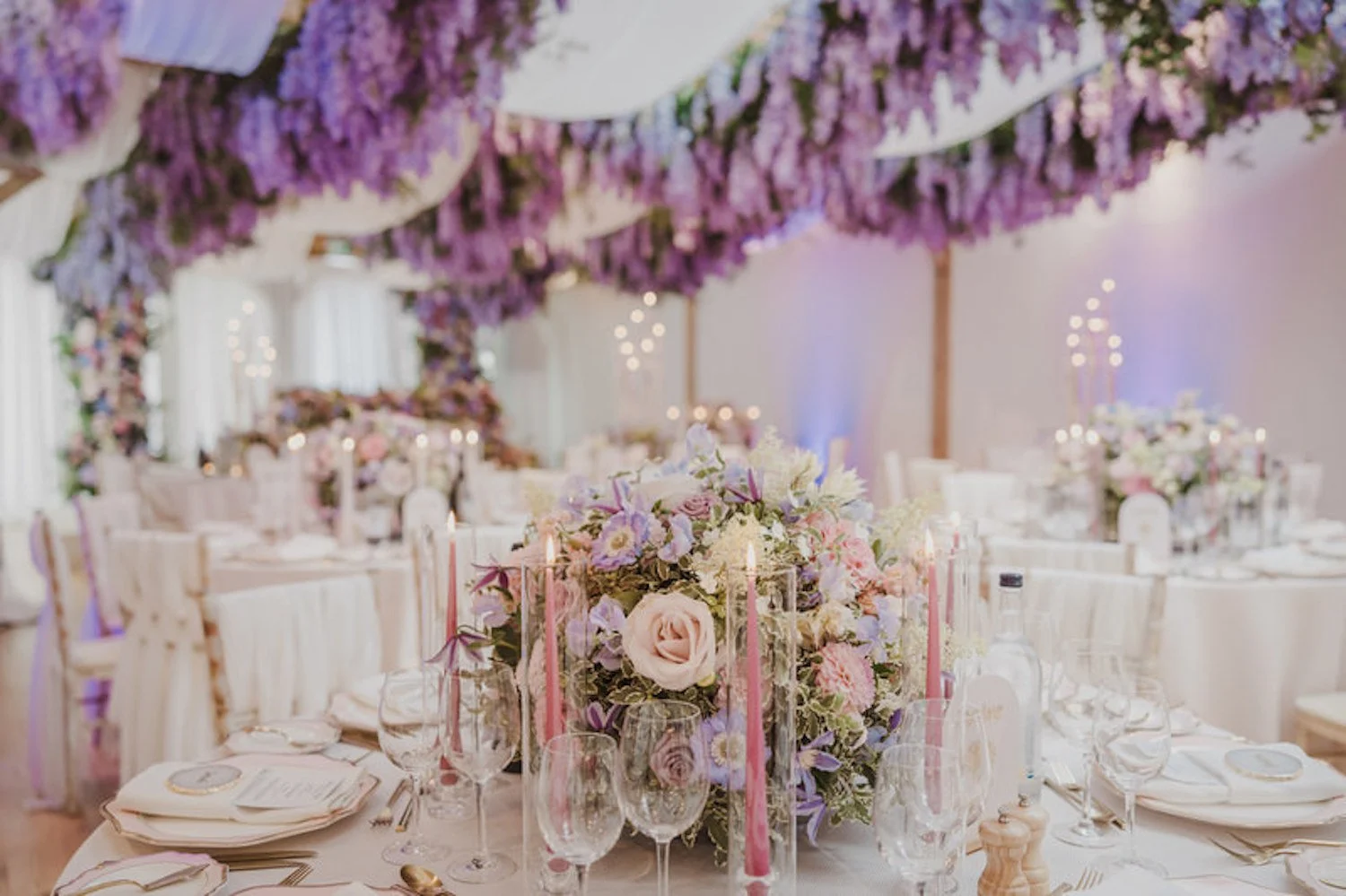
One thing I always remind couples is that your palette doesn't need to appear identically in every element. The most sophisticated weddings use colour with a bit of nuance, letting it show up boldly in the flowers, more subtly in the stationery, and as a single thread in the groomsmen's ties or the bridesmaids' bouquets. Repetition creates cohesion, but variation in how strongly a colour appears is what stops a wedding from feeling overly matched.
If you're staring at a wall of swatches feeling completely stuck, my advice is to step away from the swatches altogether for a moment. Think instead about a place, a memory, or even a favourite item of clothing that captures the feeling you want your wedding to have. The palette usually reveals itself far more naturally from there than it ever does from a colour wheel.

Not sure where to start with your palette? Get in touch and we'll build it together.